

Coming soon to a hive near you MyBroodMinder V5
Wisconsin and France, October 30th 2023
Your BroodMinder team is bursting over with excitement. We are about to enter a new phase of our mission to provide important and useful information to beekeepers around the globe.
Following the BroodMinder/Mellisphera merger last summer, Amanda went to France to work with Lorenzo for two months. Over the winter they have completed a major redesign of MyBroodMinder.com and let me tell you, it is amazing.
In April we will be transitioning to MyBroodMinder version 5.
We have taken all of our team’s learning and valuable user feedback from the last eight years and made MyBroodMinder.com more powerful and configurable for you, our fellow beekeepers.
What's new ?
There's a bunch of new things in MyBroodMinder v5. In a wrap, here are the features that will help you anticipate and manage your hives like never before.
🐝 A new powerful apiary(s) wide summary view
🐝 Fully integrated analysis features
- Brood strength
- Weather analysis
- Nectar flow predictions
- Swarming and other Alerts
- Reports
🐝 You can now build your own custom dashboards
- Data from BroodMinder devices
- Local apiary and web-based weather
- Fitness, productivity, brood, nectar-flow and foraging indexes
- 14 graph/parameter widgets you can arrange as you like!
🐝 Improved note and hive action logging
🐝 Integrated help and videos
🐝 Tighter integration with the BroodMinder Bees app
Delivering with passion
During the last eight years, MyBroodMinder.com has become a major work of software. Your BroodMinder Team is comprised of beekeepers and we are passionate about our bees and dedicated to discovering how hive monitoring will improve bee health and management.
MyBroodMinder.com is the most advanced, most configurable, most beekeeper driven web tool in the world. We hope you enjoy it as much as we do.
Let's review all these features!
Now that you got the flavour, let's dive into each of those new features.
NOTE : Over the next days, this section will be updated frequently to add every new feature as we release them through our newsletter.
Feature 1: Hives Summary view
With the Hives home page you get the essential information on how your hives are doing.
All going fine? : move to something else.
Something unexpected? : click and drill deeper.
How are my hives doing?
In MyBroodMinder v5 answering that question will be one click ahead. We have pushed far forward the idea of “How to deliver essential information on colony behavior in an extremely simple manner?”
This is the Hives summary view :
At a glance you can identify which hives need help (Fitness algorithm is assessing which ones are weak or undergone particular events). You can also assess about brood, weight and last day productivity.

We also added any particular event, alert or note you (or the alert system) could have identified. You won’t find long sentences here: information is tagged using condensate pictograms. If you were using Mellisphera you already know them. Otherwise, you’ll get familiar very quickly.
Hive history
However, hive life is not just about the past day. We wanted to be able to summarize their progress over the last week. Click on the History icon and the past week summary will unfold. If you’re tracking a nectar flow it will display how it evolves.

Drill down from here
Checking your hives, you flashed over that one, which had endured a sequence of high temperature alerts.

You wanna know more: click on the hive name and move to the charts view
Now you’re seeing the alert overlaid with the in-hive hourly temperature. We also see that T2 SwarmMinder triggered on this event too (red needles).

And you also find a contextual note you entered few hours before the event that will guide you to what happened.. but this is another story!
Feature 2: Apiary Summary view
The Apiaries page summarizes what's going on in your apiary and how things are expected to go in the next 10 days. This will be the starting point when planning your activity.
Forecasting the next steps
Similar to the hives page concept, we have pushed the idea to summarize what’s going on in the apiary. Here we are covering the full time-line from past week, today and up to 10 days ahead !
Here is the Apiary summary view :

The vertical dashed green line is “Today” and what you have on the left and on the right are past and future conditions.
On top of this “chart” you get beekeeping related information like the Foraging index (how much suitable conditions for bees to forage) and also Nectar index (conditions for plants to deliver nectar)
In this example you see that we are currently exiting 6 days of poor conditions and that over the next 10 days things will improve dramatically up to 100% Foraging index !

Are you getting the picture? it's easy right ? I bet you are already thinking on how you will plan your activity.
Let's continue describing the other information delivered by this chart:
On the mid-center, there is a summary of any apiary alerts, inspections or notes created by you or by the system.

And at the bottom part you have weather related conditions, maximal temperatures, wind and rain delivered from our weather service.
Note that you can hover every field of this chart to get deeper details (eg. notes or alerts threshold achieved). Hard to display here in a snapshot, but you will be able to test very soon in your own apiary
Feature 3: New charting and multi-select
All charts in MyBroodMinder v5 have now a contextual toolbar. Combined with the new Multi-select feature they will dramatically improve how you understand hive behavior.
Overlay hives with Multi-select
When trying to understand certain behaviors we often experience the will to compare one hive to their fellows and also to correlate with eventual actions we carried in the past. In MyBroodMinder v5 we have redesigned the charts to empower beekeepers to do so! (well “redesign” meant here changing the whole graphing library among other big back-end maneuvers)
Here is how it looks like :

Turn on the Multi-Select toggle and start overlaying hive charts. This is cool!
You can compare any hive from any apiary. You can overlay hives weight or brood or productivity, bees-count …
And you can even overlay apiaries weather data if you're seeking to find what makes a yard so specific compared to others..
And why not mixing both? : compare hives and overlay with weather data. Here are two hives with internal temperature compared to ambient temperature issued from online weather service and the local weather station. Wow, there are huge differences.

Exploring Charts Toolbar
Have you noticed the right side toolbar on both charts above? This is also new. These contextual tools can be selected while exploring the data. With them you can select the field to display : Eg. Hourly or Daily weight.
And you can also overlay notes and inspections to add more context. Here is the same chart above with notes and alerts overlaid:

Suddenly things make more sense. The Blue hive RA-23 is overheating and alerts are being reported.
We will go deeper with notes, alerts and inspections in a future newsletter. For now the main take away is that you have them available on every chart to gain more context and understanding.
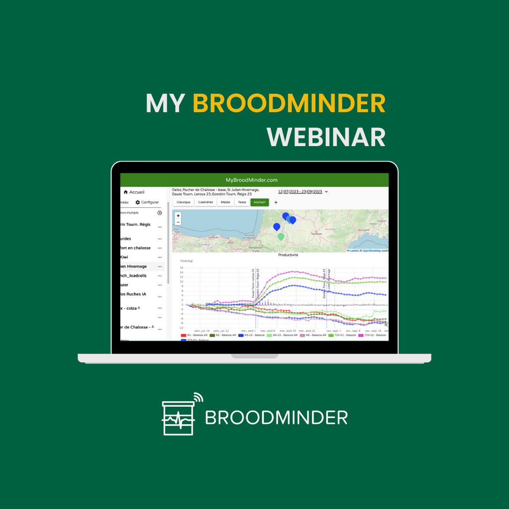
Feature 4: Custom Dashboards
Custom Dashboards are certainly a game changing feature in MyBroodMinder v5. They will help beekeepers monitor hives according to their own targets.
Why custom dashboards?
Not all beekeepers are equal nor they pay attention to the same things. Depending on your practice you might be interested in colony development (brood) or on productivity (weight). Maybe you are extremely sensitive to weather or you’re focused on hive insulation.
Whatever your interest and the BroodMinders you’re using, you can now compose Custom Dashboards fitting your exact needs! And I can tell you that this actually changes a lot when it comes to analyzing events.
How it works
On the Hives view you will find 3 main tabs :
- Classic is the classic display you know from V4.
- Calendar is the calendar-style display inherited from Mellisphera.
- Weather is a specific dashboard built to display weather history.

Those three dashboards are frozen you cannot change them. However, in V5 you can add your own custom dashboards. Hit the “+” icon next to those tabs and get started with the dashboard Composer.
This interface is very similar to a toolbox : On the left side you’ll find all the Available Charts. To build your custom dashboard, simply drag every widget to the right and reorder the way you want.

Click on Create and you’re done, the new dashboard will show up:

You can explore your dashboard, edit and modify it, resize every widget to make it best fit on your screen.. You can even share this dashboard with your fellows inside and outside of MyBroodMinder (we will talk about sharing in a future topic).
Exploring use-cases
The best way to show Custom Dashboards in action is to explore a few use cases. Here we go:
The beekeeper's Club team
You and your club fellows have multiple apiaries spread over a geographic zone and want to compare their relative conditions : mainly local weather, colony development (brood) and inspections.
How is each one of your fellows raising their bees? How are YOU doing compared to them?

The commercial beekeeper
Working as a Pro is all about decision making : Main needs during nectar flows turn around assessing Productivity, forecasting nectar flows, and deciding what is the optimal moment to move your hives to/from a specific yard.

The Pollinator
Your bees are pollinating a rapeseed yard and you need to assess what their activity is over the days. How much intense is the process being?
You installed a few scales and beecounters and get direct local weather information too. Main focus will be on Nectar-flow index and Bees activity, together with Productivity, Brood and Weather.

The breeder
You are breeding queens and selecting specific aspects. When comparing genetic lineages, automatic monitoring is useful to assess and keep record of Queen and colony dynamics.
Your focus is in Brood development and Productivity/Ressource consumption. How much resilient is the colony?

The hive insulator
Insulation is a trending topic. But there is not a single solution for every apiary on earth. You do not insulate the same in Canada and in France. You may want to assess how ambient conditions are affecting colony development. How does insulation play into it? Comparing plastic vs wood?

The above set of examples illustrate how Custom Dashboards will be helpful for beekeepers to manage their hives inline with their own beekeeping targets.
So now, let me ask you: How will your dashboard look like?
